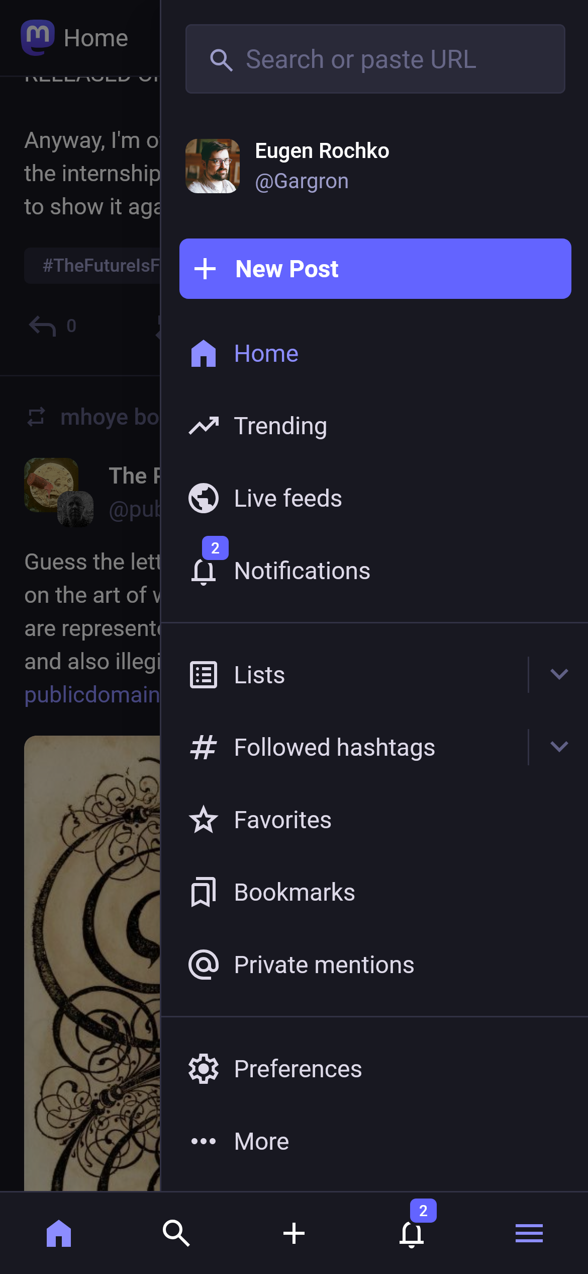
As some of you may have already noticed, in the latest #Mastodon update, we've reworked the layout of the web app for smaller screen sizes. It should be easier to navigate and more pleasant to the eye. Let me know what you think!

@Gargron Much better than the former one. Though I still insist the best version is v3.x, that's why our instance stays in v3.5 and hasn't upgraded in a long time.
@Nillia You should be aware it is not safe to run 3.5.x at this point as it has not received security updates for a very long time. I will also disagree on the design as it is not easy to navigate with the thumb when the navigation is at the top of the screen.
@Nillia @Gargron totally agree, I run a modified version of 3.5 with the navigation bar at the bottom, I would say the new update looks so much better than before, and it makes me consider finally upgrading.
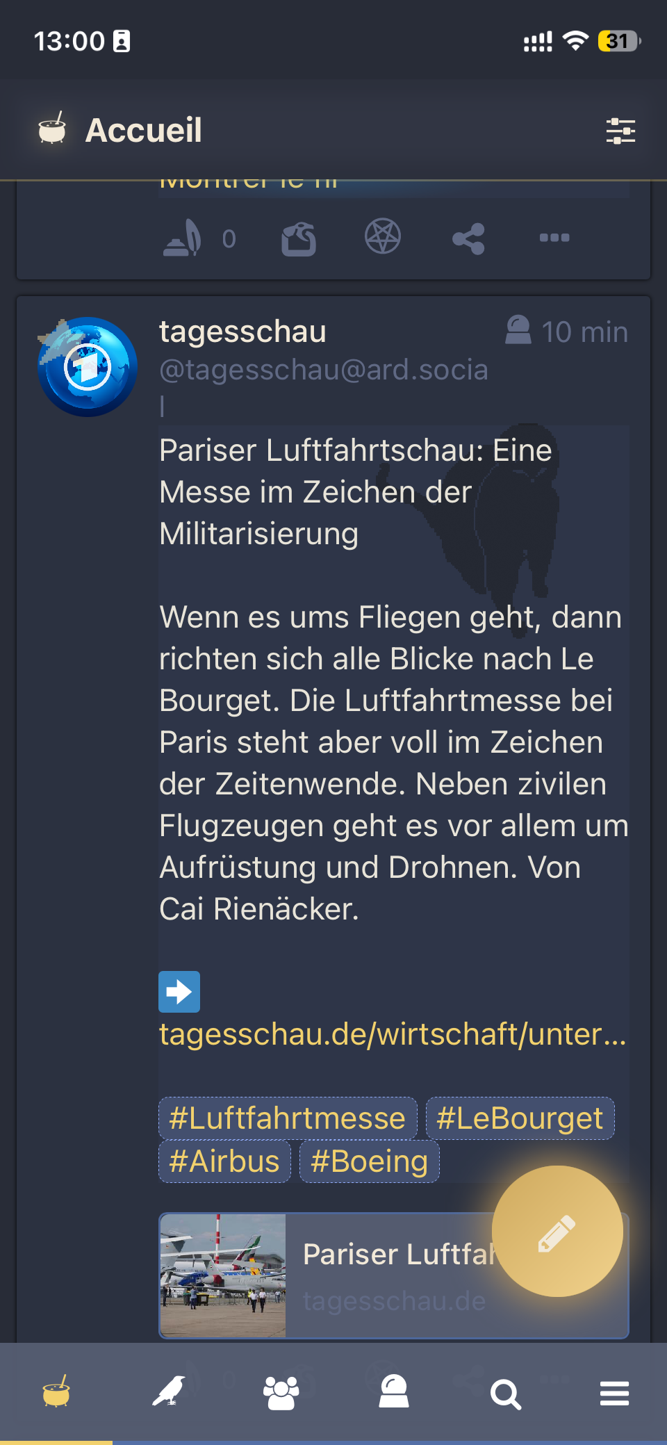
The only thing I would miss is the big round ✏️ button, which is much more intuitive than a ➕ sign.